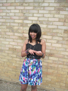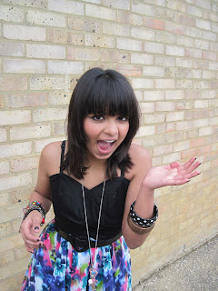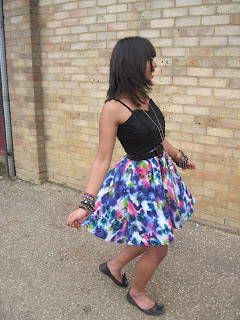


The plans that I initially had for the photos that I wanted were particularly based around a female model, and I planned for her to wear clothing that was reflective of the style that a young female audience are likely to adopt; a dress, and accessories that young females are likely to wear (bracelets in particular), and Priya (my model) also wore a necklace. I initially planned on Priya being on the front of my magazine front cover, jumping and smiling, but I also took many other photos that I considered using during the time of capturing the photos. I had in mind that my music magazine was a pop music magazine, and therefore there were certain poses that could be suitable for this genre of magazine, particularly considering the target audience and the fact that they are a young female audience. There were a lot of photographs taken that I included Priya's whole body in, and therefore these were long shots. I did this with the intention of including her full dress so the target audience of young females can examine what she is wearing (linking to the fashion element seen within the pop music magazine 'Top of the Pops'). Also, I tried to capture the natural emotions that came from Priya during the photo shoot; particularly laughter and the impression that she was enjoying this/having fun. This may attract the target audience of young females as they are likely to be enticed by the fact that Priya is enjoying her time with this magazine, and she is likely to interest the readers if she is doing so. The location of the shots did not need to be anywhere particular, because I intended to cut around Priya when I was going to place her within my magazine. Therefore, there were a variety of locations where the photo shoot was carried out, as this wasn't a particular focus and as a result could be altered. I cropped and changed many of these photographs, and some of these included here have been edited in this way.


No comments:
Post a Comment