Sunday, 13 May 2012

Photos that were used for my final production pieces

Front Cover (Main image)

Priya (my main model) jumped in the air in order for this photo to be produced. It took many attempts to get a photo that seemed adequate for my front cover of my pop music magazine. The location that the photograph was taken in did not need to be anywhere specific, and therefore when taking the photo, I was aware that the background did not need to suit my ideas. Therefore, I selected a place where it was quiet in the school and where we were able to take photos, and knew that I would be able to take away the background in order for this image to be used as my main image upon my front cover of my pop music magazine. I knew that this image would definitely be the image that was used on my front cover as I had initially planned for it to be, and inferred from the 'Top of the Pops' magazine that I had analysed that this pose is likely to appeal to a target audience of young females as firstly, the model is going to link with the main cover line, and therefore this reveals to the target audience that she is a pop star if they didn't already know. However, presumably the target audience would be familiar with the appearance of this pop star and therefore be attracted to the magazine front cover as a result of this.

In addition, it was an intention of mine for Priya's emotion to be happy and for her to be smiling, and this is because the target audience are more likely to be enticed by the magazine front cover if the main cover image is of a well known celebrity who seems friendly and eye contact is being made to the audience. As Priya is portraying a direct mode of address, the audience do feel as though she is directing the information that she gives within the pop music magazine to them. The outfit that she is wearing reflects the style that a young female audience would want to adopt; from analysing 'Top of the Pops', I inferred that the celebrity wore clothes that a mainstream audience would wear, and due to the fact that the target audience are young females, the clothes seem girly and reflect the typical clothing worn by this age group and gender (dresses). The accessories included also reflect what young girls wear; bracelets and a necklace. The pose that Priya is doing may be appealing to a target audience of young girls, who enjoy having fun and usually portray such behaviour as they are fun-loving at this age.

Front Cover (image alongside cover line)
 In order to entice my target audience, I used the idea of a boy band being present within my magazine (deducted from the pop magazine 'Top of the Pops' that I analysed). I had 4 models, who stood together and looked as though they were close and connected as a band. This is effective for my music magazine, as the cover line that I had this image alongside was stating how this boy band was going into school libraries in order to support an annual Readathon. The close proximity of these models indicates that they are supporting a cause together; and look as though they are a friendly band as they are making eye contact with the target audience (direct mode of address) and have their arms around each other, portraying friendliness. I took the photo in the school library, however I did not need to crop this band away from the background of books because the cover line that it went alongside was related to the band visiting school libraries, therefore it was a background that was suitable. The clothing that these models wear seem to focus upon the colour black, and this links the band and again tries to follow a consistency with the pop music magazine as a whole. The colours also link with the main model on the front cover (Priya) who is within the main image; she wears a dress that includes the colour black and eye make-up which also follows this colour scheme. The camera shot is a long shot, which is effective as the target audience can see the full outfit that these models are wearing (therefore seeing the colour scheme being consistent), and it makes sure that the target audience can see that the boy band is in a school library and therefore connects with the cover line.

Front cover (image alongside cover line)
The final image placed upon my front cover was an image of "Sam.W". This image relates to the one above of the boy band, as Sam.W is a member of this boy band. This is a long shot of the band member, and this is   effective as again the audience are able to see what he is wearing, which entices them to read the magazine as a young audience is interested in the clothing that pop stars wear. Again, the pop star is making eye contact with the target audience (direct mode of address) which keeps them engaged with the front cover of the music magazine. Sam.W looks relaxed within this photo, which is also likely to entice the target audience as he seems as though he is laid back and it links with the cover line that indicates that he is a friendly person as the audience are able to share their inspirational stories with him. The background of the picture did not need to be anything specific, as I was going to crop the model away from it when placing it upon my front cover.
Contents page
The photo above is similar to the one before it, although there is not a direct mode of address being made by Sam.W this time to the audience. Instead, he seems to be looking into the distance, which is effective as it suggests that he is thinking, and this links with the article that it is placed upon the contents page for; that people share their inspirational stories and it may be inferred that he is talking to one of the members of the target audience, as if he is looking towards them. The background was used when I placed it upon my contents page, which means that it was useful for my model to be standing in front of this wall. This is because it fitted well alongside the introductory line/title at the top of the contents page in a square/rectangle shape, and also suited the background shapes that I had formed in order for the contents page to come together well.

Contents page
Contents page


I cut out two models who I captured dancing when I was at a sleepover. I placed them upon my contents page as they linked well with an article that I made up which stated information about a "Dance guide" that the magazine provided to the target audience. The models are wearing clothing which are likely to be appealing to the target audience of young females as the items seem colourful, as well as up-to-date with current fashion. The image on the left was taken at a low angle, and this is effective as it presents the dance move that the model is carrying out well and the target audience are able to imitate this as a result. The facial expression of the model seems to be happy as she is dancing, and therefore the target audience may be more inclined to read the content of the magazine because they would want to be happy as she is, and it seems as though if they carry out this dance move then they will consequently have fun. The audience also may get the impression that the model is in the middle of dancing within this image, as her hair seems to be in motion as it's in the air. This is effective as it makes it seem as though she is actually dancing, likewise to the image on the right whereby I cropped out the model on the right within this image, and her expression is also happy, which emphasises that these dance moves will bring the target audience joy and laughter. The background of both of the images did not need to be anything specific, as I cropped out both models when placing them upon my contents page.


Above are images which were taken also at a sleepover. As the 'Top of the Pop's' magazine that I analysed indicated that a target audience of young females are interested within clothing and fashion, I linked images of clothing to an article included upon my contents page. In order to do so, I cropped out many of the pieces of clothing that were in these images. Therefore, the background did not need to be a specific location and the facial expressions of the models did not need to  portray a certain emotion either as they were not included. 

Contents page
Priya is located upon my contents page, linking to the front cover where she is the main model within my main image. Here, Priya looks as though she is carefree and is having fun, as her hands are in the air and her mouth is open. This is likely to be appealing to the target audience of young females as this age range usually would like to have fun and by seeing an admired artist upon the contents page having fun, they are likely to be intrigued and want to read the article connected to her due to her behaviour that seems to be displayed within this image. The image being a long shot again allows the audience to see what Priya is wearing, and also when they see this image, they are likely to relate it back to the front cover whereby she is wearing the same clothes and therefore it links with the main story that she is jumping for in the main image. The background did not need to be anything specific as I cropped Priya away from this.

Double page spread
The only image used upon my double page spread was the one above; of Priya who was also upon my front cover and contents page. Again, her clothing is the same to the images that she wears upon the front cover and the contents page, which allows the audience to link these images together and be guided to this article. The background again did not need to be anything specific as I cropped Priya out of this image and made it larger, placing it in the centre of the double page spread. Priya's facial expression portrays the emotion of happiness, indicated by her smile, which is appealing to the target audience as they want to feel happy too, and she seems friendly. Eye contact is made again, which allows the audience to be engaged with the magazine (direct mode of address).

Photos that I considered using


The plans that I initially had for the photos that I wanted were particularly based around a female model, and I planned for her to wear clothing that was reflective of the style that a young female audience are likely to adopt; a dress, and accessories that young females are likely to wear (bracelets in particular), and Priya (my model) also wore a necklace. I initially planned on Priya being on the front of my magazine front cover, jumping and smiling, but I also took many other photos that I considered using during the time of capturing the photos. I had in mind that my music magazine was a pop music magazine, and therefore there were certain poses that could be suitable for this genre of magazine, particularly considering the target audience and the fact that they are a young female audience. There were a lot of photographs taken that I included Priya's whole body in, and therefore these were long shots. I did this with the intention of including her full dress so the target audience of young females can examine what she is wearing (linking to the fashion element seen within the pop music magazine 'Top of the Pops'). Also, I tried to capture the natural emotions that came from Priya during the photo shoot;  particularly laughter and the impression that she was enjoying this/having fun. This may attract the target audience of young females as they are likely to be enticed by the fact that Priya is enjoying her time with this magazine, and she is likely to interest the readers if she is doing so. The location of the shots did not need to be anywhere particular, because I intended to cut around Priya when I was going to place her within my magazine. Therefore, there were a variety of locations where the photo shoot was carried out, as this wasn't a particular focus and as a result could be altered. I cropped and changed many of these photographs, and some of these included here have been edited in this way.

Saturday, 12 May 2012

Pop Music Magazine Analysis- 'Top of the Pops' Double Page Spread


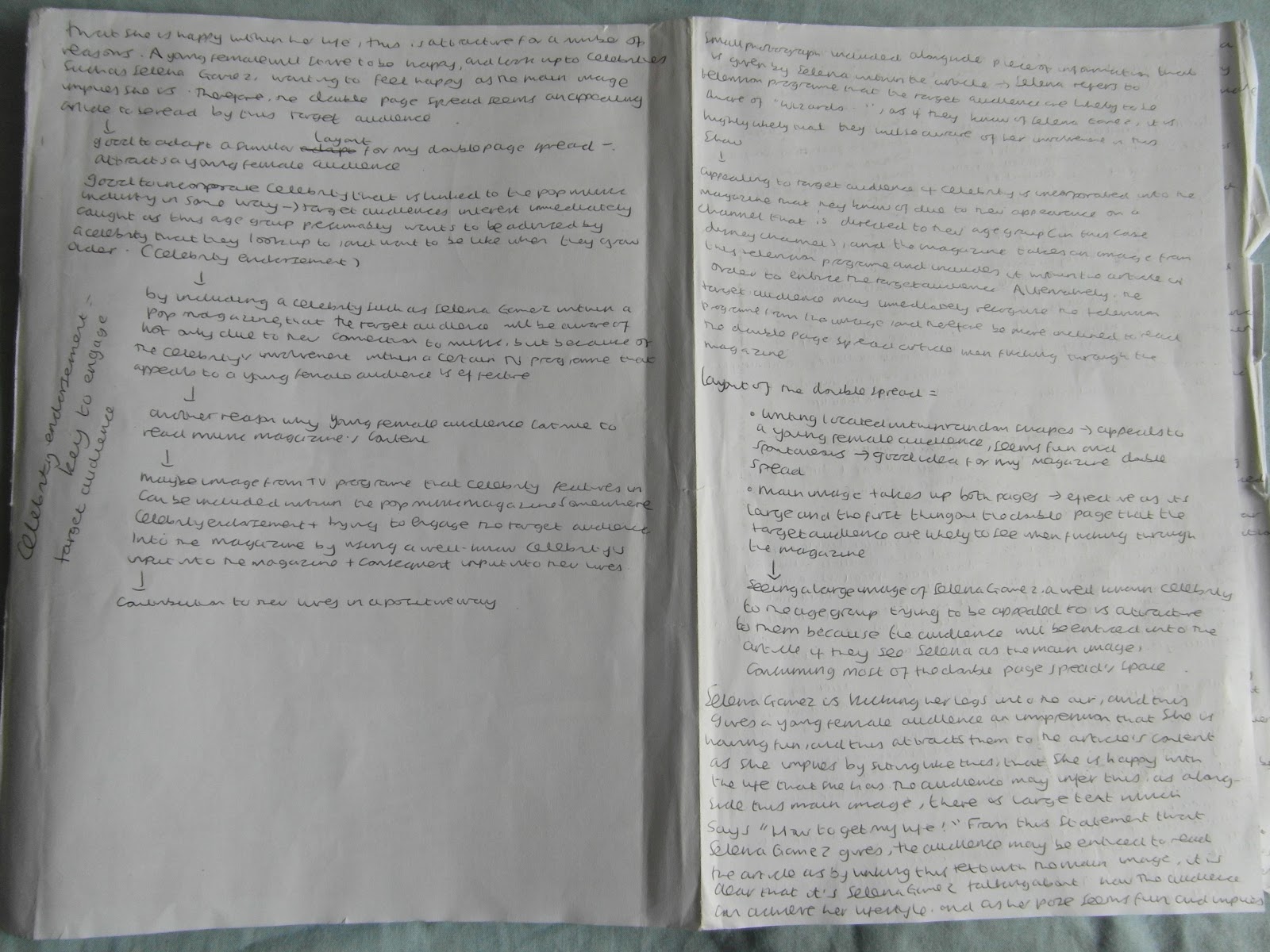
The double page spread of an issue of 'Top of the Pop's' helped me to learn the conventions of a double page spread that would be located within the contents of a pop music magazine such as this. Firstly, I was influenced by the image located upon the double page spread; it is very large and can go from one page to the other. This makes the double page spread connect well, and keeps the target audience engaged because it seems like an article with a lot of information. There is large text upon one of the pages which initially may attract the target audience; "How to get my life!". The audience will imply that the celebrity upon the double page spread is saying this, and therefore may be more inclined to read the article because they want to read about their admired celebrity/celebrity that they are familiar with. The double page spread links with the front cover; Selena Gomez is the celebrity that features upon both, and this is effective as she is a well known celebrity for this age group, particularly due to her involvement within the television programme on Disney Channel 'Wizards of Waverley Place'. This is an effective way of enticing members of the young female audience that this magazine is trying to appeal to; they may recognise her from this programme and therefore be inclined to purchase the magazine. Alternatively, they may know her for her singing and therefore this is the reason why she has been included upon the front cover and upon a double spread within this pop music magazine. This is an example of how the magazine tries to incorporate celebrities that are related to media other than music; television for example, and this is appealing to a young female audience.


I learnt that it is effective to include an introduction to the article upon the double page spread; that it summarises the article as a whole and tends to draw the audience in by including the most important and appealing sections/information within the article. The introduction to this double page spread is "She's bursting with confidence, has a bunch of fab friends and a fit boyfriend. Want to know SEL's secret? Just follow her amazing tips and tricks..." There are many techniques included within this introduction that may appeal to a target audience of young females. Firstly, the phrase "She's bursting with confidence..." is appealing as at the age that the young female audience are at, they are usually striving to be confident and need advice on how to be usually from outside sources such as magazines. In addition, the phrase "...has a bunch of fab friends" entices the target audience to read the double page spread because it uses language that is easily accessible to a young female audience. Words such as "fab" and "bunch" are words that are likely to be used and heard among this young age range, and therefore the article may be of interest to the target audience through the use of these.

Furthermore, the phrase "...and a fit boyfriend" appeals to a young female audience because they are interested in boys at this age, as indicated by this magazine on the front cover and contents page also when they mention "12 hot lads" and "We love boys". A rhetorical question is also used within the introduction to the double page spread; "Want to know SEL's secret?". The use of a rhetorical question entices the audience to read the article as they find themselves wanting "to know SEL's secret"; the use of the language "secret" implies that this magazine has information which is exclusive and therefore it is unlikely that it will be found in another magazine. This makes it stand out from its competitors, and in addition, how the magazine refers to Selena Gomez, as "SEL" implies that they may be friends with Selena; friends use nicknames. This also may make the audience feel as though they are friends with Selena too. The end sentence of "Just follow her amazing tips and tricks" may attract the target audience, as it implies that in order to "...know SEL's secret" they have to "...follow her amazing tips and tricks". They state "Just", which suggests it is easy to adapt their lifestyle to that of Selena's and achieve what is stated before this, and this is appealing as a target audience of young females are likely to read on as it seems simplistic to achieve things that they want to experience.

Alliteration again is used within this magazine, "Fantastic friendships Selena says..."; this catches the eye of the target audience immediately. The colour scheme of the double page spread again complies with the colour scheme seen upon the front cover and the contents page; the colours are pink, white and black in particular. The image of Selena Gomez also complies to this colour scheme; she is wearing clothes and shoes that are black, and her make-up also matches this colour scheme with red lipstick and black eye make-up. This implies that a young female audience are more likely to keep engaged with the content of the magazine if the colour scheme is consistent and the image of a celebrity/artist blends in with this colour scheme, so everything seems linked and together. Shapes also seem to be a well used visual tool within magazines that are trying to appeal to a young audience from this double page spread. I analysed much of the language that the article consists of also, as seen within the images above.

Pop Music Magazine Analysis- 'Top of the Pops' Contents Page


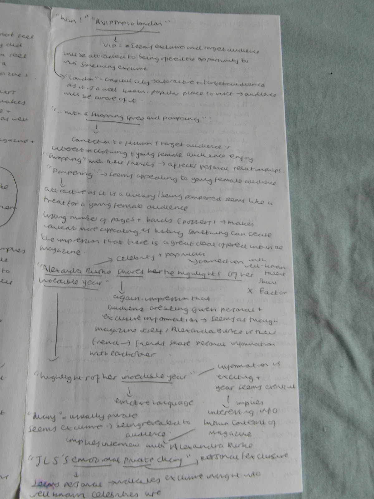
I analysed a contents page from an issue of 'Top of the Pop's'. By doing so, it was clear to me the types of stories included within a pop music magazine, particularly learning from this that within a pop magazine which is targeted at a young female audience, the stories included have to relate to their lives away from music too. By being a pop music magazine, this indicates that a large audience will be interested within it, as pop music is usually enjoyed by a great number of people (this type of music is called 'pop' because it is popular and mainstream). To elaborate, images are included again upon the magazine's contents page, and this emphasises the idea that a young audience are likely to take in the information presented to them within a magazine via a magazine's use of visual tools such as these, likewise to the front cover of this issue of 'Top of the Pops'.


It is evident that within this pop music magazine's contents page, the magazine is constantly trying to appeal to a young female audience. This is indicated through the use of language, which the audience are likely to relate to at their young age. This language is simplistic and words are used which the age group being targeted would use frequently. The phrase "We love shopping" appeals to the target audience as young females are likely to enjoy shopping; it is a common activity carried out by young females, and as this pop magazine is targeted at a mainstream audience, shopping is likely to be enjoyed by these readers. The use of the word 'We' implies to the target audience that the magazine is including them, almost as though they are a friend to them. The target audience feel, as a result of this use of language, that they are contributing to the magazine in some way and therefore are appealed to it as it seems as though it involves them. One of the articles stated expresses; "Everyone's wearing..." This phrase appeals to the target audience, as 'Top of the Pop's' is trying to attract a young female audience, and at a young age girls usually want to adapt their style to the current fashion; styles and clothing that the majority of the people their age are wearing.

The article "How to get classy curls" is effective upon the contents page, due to the fact that alliteration is used firstly. "Classy Curls" may attract the target audience's eye, and it also appeals to a young female audience as it implies that the magazine is going to provide them with instructions on how to achieve a look that will make them fashionable. The description provided of the "Curls" is "Classy", and this adjective is appealing as it's a positive and admirable description that a young female audience will be attracted to. The contents page includes the use of second person; articles such as "How YOU can live like Selena" and "Your say with CBBC's Dick and Dom" is appealing to the target audience as the use of "you" and "your" implies that what the magazine is saying is being directed at to the individual who is reading the magazine. The incorporation of celebrities within the articles makes the magazine appealing as the target audience recognise the names and are more inclined to purchase the magazine as a result of this, as their favourite/admired artists appear.

The article "Win 1D's signed ipod shuffles with the lads personal playlists" is appealing to the target audience of young females as the use of the word "Lad" is a colloquial term, and therefore the target audience for this pop music magazine is likely to be aware of this word and use it frequently, which makes the magazine attractive to the target audience as they are able to access the language easily. The fact that the target audience have the chance of winning something which includes "personal playlists" of an admired band of theirs, is appealing to them as it may feel as though they are receiving a gift from their favourite celebrity if they win the competition. The use of "1D" indicates that this band must be well known, as by presenting their name in this way it implies that the target audience are aware of them; instantly when they see "1D" they know that the magazine is referring to the band One Direction. This shortening of bands included within the pop magazine implies that a young audience is able to understand something when it is shortened if well known; connecting to a young person's use of their phone as they are likely to text often; shortening language connects to text language e.g. the use of LOL for laugh out loud and OMG for oh my gosh. The target audience of young females will be able to access this type of language generally as they are familiar with it and therefore they presumably will understand such words that are shortened.

Furthermore, the phrase included within this contents page "hottest accessory" is attractive to a young female audience, as it relates to fashion and the clothes that they wear; again it emphasises how a pop music magazine aimed at such an audience needs to take into account what their lifestyle is like in order to seem appealing to them. A young female audience will be interested in accessories as they are aware of their appearance and usually want to keep up-to-date with the styles that their age group are adapting to. Visual tools are also used once again as upon the contents page, with a smaller image of the front cover of 'Top of the Pops' located upon it, and this is labelled in order to guide the audience to the pages where the articles featured upon the front cover are within the magazine. There are also other visual tools included that are likely to keep a young female audience engaged; images of clothing and accessories, which are also labelled with the number of the page that these can be seen upon. Upon my own contents page, it would be effective therefore to include the number of the pages that the images relate to that I'm going to include upon it.

It was clear that at the top of the contents page, in order to direct the target audience of young females to the  list of articles, the magazine included a banner that implied that this was the contents page; "Inside the mag..."    This is useful in a variety of ways; firstly, the colour of the banner atttracts the target audience to read what it upon it as it is segregated the text written within this from the rest of the page, and therefore due to the fact that it is segregated, it's information that the audience are likely to process first, and this is effective as the magazine directs them to read what the magazine consists of through this banner. The "..." included after "Inside the mag" is effective as it directs the target audience to the information that the magazine consists of. This is a useful technique to include within my contents page in order to direct a young female audience to read the contents of the magazine.

There seems to be certain parts of a young female's life that pop magazines such as 'Top of the Pops' appeal to, when looking at the contents page. As the articles are segregated according to the interest that it is linking to, this helps with my contents page as it is clear what a young female audience reading a pop music magazine wants to read about; "We love shopping" refers to the interest of shopping, and therefore indicates to me that a young female audience would want to see articles upon the contents page that are related to shopping/fashion. Linking with this, there are images of clothing and accessories which attracts them to this section as they are visual tools that are easily accessible by a young audience. There is a section which is entitled "All About You", and this attracts the target audience, as it involves them within their magazine; focusing upon their lifestyles e.g. "How YOU can live like Selena", along with articles which link to the interactivity that the magazine offers; "Your oops! Share your shame with Radio 1's Aled & Dr Mel". Here, the mention of a radio station is appealing to the target audience because the magazine is based on pop music, and therefore the target audience of young females are likely to listen to the radio frequently as 'pop music' is mainstream and therefore it seems as though there will be a large audience who do listen to the radio that read this magazine. Including DJ's "Aled & Dr Mel" is effective as the audience are likely to be aware of who they are if they listen to the radio station "Radio 1", and it is likely that they have either heard of or listened to this radio station, which  means that the incorporation of Radio DJ's does make it appealing to this young audience.

Moreover, "Celebs & gossip" as a section includes celebrity names, and therefore the target audience are likely to be attracted to the magazine's content as they recognise artists written upon the page; for example "JLS", "The Wanted", "Olly Murs" and many more; a target audience of young females are enticed by information about their favourite/admired celebrities. A visual tool is included again, an image of a poster provided by 'Top of the Pops' to it's readers, of two members of the band "One Direction". This again is effective as a young female audience find this easily accessible and are attracted to an image of members from their favourite band. "Wins & Offers" as the title of a section is effective, as the target audience are likely to be attracted to the magazine if it offers them a chance to win prizes that they are interested in; for example, an article stated is "Win! 1D's signed iPod shuffles with the lads' personal playlists", and this is effective because the audience will be interested in the prize that they will recieve if they win the competition; it is a prize which relates to a familiar pop band. Linking with one of the competitions, "Win! Doodles and dolls from The Wanted", a visual tool is included within this section which is an image of one of the band members "from The Wanted" writing something, and therefore this entices the target audience as it is more believable that their favourite band has contributed to their prize if they win.

The colour scheme of this contents page is consistent with the colours that are used on the front cover, which  teaches me that the colours chosen for my magazine front cover, contents page and double page spread should be consistent in order for the target audience to keep engaged.


Friday, 11 May 2012

Pop Music Magazine Analysis- 'Top of the Pops' Front Cover


This is the front cover that I analysed. Once choosing the genre of music magazine that I wanted to create my music magazine around, I had to analyse a front cover of a magazine already on the market in this genre. I chose 'Top of the Pops' magazine, mainly because it seems to be the main pop music magazine available to the target audience interested in this genre of music. As I looked at the magazine front cover, many of the choices that the producer of this media product made led me to imply that the target audience of the magazine was a young female audience. Many of these elements incorporated into the front cover of this magazine will be considered during my production, and 'Top of the Pops' will be a useful source for me to refer to when I need help during this process of producing my own music magazine front cover.


Beginning to analyse this front cover of 'Top of the Pops', I pointed out the effectiveness of a banner upon a magazine front cover. Straight away, the information within this banner is highlighted as the banner segregates it from the rest of the cover, thereby implying to the audience that it is of significance to their lives. Within the banner, the information included helps me to infer that music magazines in the genre of pop strive to relate to their target audience's lifestyle in a number of ways away from music. Included upon the front cover of this pop magazine, the cover line 'Amazing offer! 10% off at Pineapple' is enticing as it implies that as a result of buying the magazine, an offer for a brand that they are likely to be familiar with and find attractive comes with   this purchase. The logo of 'Pineapple' as a brand is included upon the front cover, and this is effective as when browsing magazines that are being sold, the target audience of 'Top of the Pops' are likely to notice the logo, and as they are familiar with it, be drawn to the magazine straight away. This is a useful way of enticing the member of the target audience upon first glance; it is a visual tool used in order to attract the eye immediately and make the magazine instantly more attractive. This is something that I could incorporate into my music magazine; focusing upon the target audience for my 'Pop' magazine and including a visual tool such as a logo in order to entice them upon first glance. This could be a logo for a popular/well known brand among that age range, or alternatively a well known name of a type of media that the target audience consumes frequently.

The use of numbers upon this pop music magazine is clearly used as a way of bringing different members of their target audience to purchase their magazine. By using numbers upon a magazine front cover, the target audience may be more inclined to purchase it because the numbers seem to imply that there is a lot of information available within the magazine. The use of numbers usually means that the target audience notice how much is included within the magazine's content, thereby are usually more inclined to purchase the magazine. The coverline 'star styles to copy' is appealing to the target audience as they are a young female audience who idolise these 'stars' mentioned; the stars are presumably celebrities who they are interested in and therefore they are likely to want to copy the styles that they have. They usually want to share something in common with these celebrities, and by adapting their style to that of their idol allows them to do so. To elaborate, the target audience of young females may have an intention of one day looking like their idols, and by including a feature which will help them to do so (by giving them information regarding the styles of these celebrities), the magazine instantly seems more appealing.

Celebrity endorsement is also used as an enticement upon this magazine front cover; an image is included of a celebrity popstar that the target audience are likely to be familiar with. There is an implication that this celebrity is well known among the target audience, as the image of this celebrity is located within the box that links with the coverline '89 star styles to copy', which suggests that she is one of these 'stars'. Tulisa is a well known popstar, and the target audience may be inclined to purchase the magazine because they are interested in her life, or alternatively enjoy her music. She has recently been involved in the talent show 'The X Factor', which may entice the target audience even more because the magazine is current and includes information about celebrities who are in the limelight at the current time. There is also a large interest in the style of X Factor judges usually within the media, and this information shared with the target audience therefore is likely to be appealing to them.


The front cover includes the main coverline, and ends this with 'by Selena x' in a different font type compared to the rest of the text included upon the front cover. This implies that it is 'Selena's' handwriting, which makes it personal and therefore may be appealing to the target audience of young females as the magazine seems as though the celebrity included within the main image of the front cover has contributed to it. The incorporation of this text also gives the target audience the impression that 'Selena' is a friend to them, because the use of the 'x' is usually used between friends or those who care for eachother. This may appeal to members of a young female audience as they are likely to idolise the celebrity included within the main image; they may be attracted by the fact that she seems friendly towards them. The coverline 'Flirt Alert: Celebs caught kissing' is attractive to the target audience due to the fact that it indicates to them that the magazine has exclusive information; the word 'caught' implies that the magazine took photos or have obtained information that these celebrities didn't want to be revealed to the public. Therefore, this information seems secretive and implies that it can only be found in this particular magazine, and this attracts the target audience as it seems exclusive and as though it is revealing information about celebrities they are likely to be interested in. This may make it stand out from it's competitors, as this information isn't likely to be found in these magazines too, which consequently makes it unique.

The rule of three is used through the coverline 'Mad, Bad and Dangerous', and this is located on the left third. By using the rule of three, the magazine is likely to attract members of the target audience, as it is an effective technique that draws people in to read the rest of the content by seeming short yet revealing information about the artists. The phrase 'the unseen side of Little Mix' is appealing as it seems to be revealing something about a new band; the target audience of young females are likely to be interested because they are new to the music scene and the public know little about their personal lives due to this. This magazine, however, will allow them to learn about their lives, which makes it attractive to the target audience. The magazine seems to generally reveal the behaviour that a young female audience would want to imitate; the positioning of the band 'Little Mix', with their mouths open. The colour scheme of the magazine front cover, consisting of turquoise, pink and white, seems feminine and therefore would presumably immediately attract a young female audience to the magazine when seeing this.


Studying this magazine front cover has allowed me to infer how a pop magazine attracts it's  target audience, I began to form ideas for my own front cover of a pop magazine. I noted any important aspects that I thought should be included upon my front cover in order for it to be recognised as a pop music magazine. Certain conventions, I found, were present upon the 'Top of the Pops' magazine front cover, that I could possibly be inspired from. For example, I noted that I could maybe include an offer linking to a well-known brand that the audience are aware of, likewise to this 'Top of the Pops' magazine which includes an offer for 'Pineapple', a well-known brand recognisable to a young female audience. I also inferred from the magazine front cover that it is a good idea to include small images of celebrities that the target audience of the magazine are likely to be aware of; these could be placed alongside coverlines upon my magazine front cover, and from this I learnt that it is key to place visual tools upon my magazine front cover if I am trying to attract a younger audience, as they can relate to images straight away when glancing at the magazine, therefore an image is more likely to catch their attention than text upon a magazine front cover.

From this pop music magazine, it was clear that it is good to include a fashion element within it, as it is likely to relate to the lives of members of a young female audience that like this magazine I will be trying to attract through my front cover. Presumably, the majority of a young female audience would be interested in fashion as they are aware of what they wear, and try to adapt their styles to current ones presented in magazines such as this. A magazine is one of the media sources whereby they get their information from regarding fashion, alongside the television, internet and radio etc. As a magazine allows them to consume information via visual tools usually, it is important to include information about their everyday life as they can relate to the visual aspects of the magazines well and therefore are likely to want to consume information in this way. It was evident through my analysis that maybe an article could be included that gives advice to a young female audience; at this point in their lives, they are likely to come across common problems that causes them to seek advice from outside sources that are usually unbiased. An insight into an artists life (someone who is likely to be of interest to the target audience that is trying to be attracted) could be included upon my magazine front cover; as it is evident from this front cover that members of the target audience enjoy/are intrigued by information regarding a celebrity that they know of, through the headlines that refer to the lives of celebrities such as 'JLS' and 'Selena' Gomez.


Monday, 7 May 2012

Kerrang music magazine analysis


Prior to starting to plan my own  music magazine's front cover, in order to get an idea of the types of elements that compiled to form a typical magazine front cover, I analysed a magazine that already exists. "Kerrang" is a music magazine that has existed for some time on the media market, and is a rock music magazine, which can be seen immediately from the masthead of the magazine. Focusing particularly  upon this at first, the music magazine's front cover evidently portrays a rock genre, as the lettering is in capital letters, bold and very large across the page. Alongside this, the writing is cracked, which implies a rock genre as it suits the behaviour of rock stars, as being random as well as very spontaneous. The masthead immediately suggests that the magazine is exciting through the masthead, and will be entertaining, as there is an exclamation mark following the title "Kerrang", which emphasises how the genre of this music magazine is rock as it reflects the behaviour of rock stars and those who enjoy rock music; they usually are carefree and very lively.

To elaborate, upon this magazine front cover there is an opportunity for the target audience to 'Win' something, and this is an appealing element to Kerrang as a magazine, as the opportunity to win something entices many members of the target audience. The prize that they could win is also appealing, as it is something that Kerrang's target audience are likely to be interested in. 'A meet and greet with You Me At Six' is an appealing prize to the target audience as the band that they have a chance of meeting is one that they are likely to be interested in, as it is a band in the genre of the magazine that they have bought. Another appealing element of the magazine front cover is the use of language such as 'new' and 'revealed'. 'New' suggests that there is something up-to-date included within the magazine, that possibly will be the first time that the target audience here of this information. The information is also likely to be appealing to the target audience, and related to their particular interests.

Including an article on the subject of 'Valentines day' implies that a young target audience is trying to be appealed to, as this age group is more involved in this occasion in general. To elaborate, there are posters included within this magazine, as indicated by the coverline 'Valentines poster special'. This indicates that the target audience will be gaining something extra by buying the magazine; and this is appealing as the posters are of artists that are popular in the genre of music that this magazine reflects. The magazine states these artists as 'Oli Sykes' and 'Cristina Scabbia', and writes after this 'and more', which entices the target audience to buy the magazine and find out which other artists are featured upon a free poster. Similarly, the magazine 'Top of the Pop's' includes posters of artists that are popular within the genre of Pop, and also seem to link this with young girls having a crush on these Pop stars. This appeals to the target audience of young girls, similar to Kerrang who are trying to appeal to a young audience who are interested in particular artists in the genre of rock and Kerrang link this to love. This also shows how Kerrang are aware of the time of year that the issue is being sold within, and incorporate this within the magazine in order to appeal to the target audience; it seems to link with their current lives, as Valentines Day will probably be celebrated by a younger audience more than an older one, and this is the age range that Kerrang are trying to appeal to.

A banner is included upon the front cover of Kerrang in order to attract the target audience by having this information segregated from the rest of the front cover. This implies to the audience who see the front cover that this information is important and is being highlighted by Kerrang for them to make sure that they read. This is an effective part of a magazine front cover that can be incorporated into many magazines, including those under the genre of Pop. For example, the magazine 'Top of the Pops' incorporates a banner into their front cover, in order to attract their target audience of young girls who listen to Pop music. Here, the Pop music magazine tries to appeal to the young girl's lives away from music, by stating an offer related to a clothing brand 'Pineapple', that evidently is popular with this age group. Upon a magazine banner, usually there is information that would be particularly appealing to the type of target audience, and it is likely to be read as it is highlighted specifically by the magazine at the top of the page and segregated.

Kerrang states a cover line which expresses; "The Ultimate Love Guide" This is yet another reference to the time of year that this issue of the magazine is being released within ('February 13th 2010, as stated as the date of the magazine's publication); near the special occasion which is Valentines Day (14th February). This is effective as the magazine strives to relate to the target audience's life away from music; as love and relationships are common within the majority of young people's lives, as this magazine is trying to appeal to a young audience, a 'Guide' that is likely to help them with relationships, it is appealing to them. Valentines Day is also an occasion which is publicised to a large mainstream audience, and has become a novelty day almost, with people finding it appealing as it is popular and allows them to celebrate their love for someone.

The magazine seems to be giving something to the target audience; assisting them, and therefore providing them with a reason to buy the magazine as it is beneficial to them. The use of symbols upon the magazine seems effective with this magazine, as the symbol of a love heart is located nearby a cover line which is linked to Valentines Day; a visual tool such as this is effective as it is likely to draw the audience into the magazine front cover initially when they are glancing at magazines. As it is the time of year whereby the special occasion Valentines Day will be celebrated, a love heart indicates straight away to the audience that the magazine will be referring to this occasion which they are likely to celebrate if in a relationship. Another visual tool near this is a man and a woman located near each other, which also indicates love or a relationship, which relates to the special occasion of Valentines Day. The people are also celebrities, which is likely to attract the target audience too as they will be interested just by the sight of their favourite artists.

The location of one of the Valentines Day cover lines is on the left third, the 'Valentines Poster Special', and this is effective because the target audience will be attracted to this straight away, especially with the presence of the heart as a visual tool. The target audience are able to immediately see this cover line as the location of the left third is somewhere where the information is usually seen rapidly. The main cover line "Enter Shakari and the King Blues" links with the main image, as they both refer to a particular band that the target audience are likely to be familiar with. The direct mode of address of the main image is effective as the audience feel involved straight away with the magazine; the eye contact that seems to be made between the artists within the main image and the audience engages the target audience as they become attached to the magazine due to this emotional connection. As in real life, when someone makes eye contact with another person, there seems to be a connection and establishment of understanding between the two people, and this can be reflected through the direct mode of address of the main image. Therefore, it seems key to include a direct mode of address if a celebrity is included within the front cover of the magazine, in any genre; the target audience begin to attach themselves emotionally to the magazine as eye contact is made. For example, the magazine 'Top of the Pops' also seems to have a direct mode of address through the main image; the audience want to connect with the artist that they are interested in and this helps them to do so, whatever the target audience may be interested in, regardless of genre or type of magazine. 

An enticement of the magazine is the part of the main cover line, whereby there seems to be a section of speech taken from an artist that the target audience are likely to be interested in; by including this, it seems as though this celebrity has contributed to the magazine and provided their input to the main article within the content of the magazine (as the main cover line usually links with the main focus of the magazine, and therefore to an important article inside). The names of bands listed at the bottom of the front page attracts the target audience as if they spot a band that they particularly like (which is likely to be the case because the bands listed are within the genre of music that the magazine is focused upon), then they are more likely to be interested in the magazine as it has information about one of their favourite bands. The use of the symbol '+' also appeals to the target audience as it implies that there is extra information for them, and if a list of something follows after the plus sign, then it seems as though there is much more information within the magazine that hasn't already been mentioned in the other cover lines on the front cover of it. 


Wednesday, 2 May 2012

Why Kerrang & other magazines fulfil their expectations


Analysing the magazine Kerrang, and particularly focusing upon why Kerrang as a magazine fulfils it's expectations, I deducted that there is a certain expectation for how different genres of music magazines should appear; there are specific criteria that are usually met according to the genre of the music magazine. I also realised that the language used within the magazine appeals to the target audience, and suits this audience as it comes across in a way which the audience can understand and relate to. To elaborate, when analysing an article within the magazine Kerrang, I discovered that they used language such as 'yeah' in order to come across in a certain way to their target audience. This language is easily understood to the majority of the audience reading, and this is effective as it is easily accessible. The target audience is more likely to buy the issue of this magazine again if the language is easy to read, as they are taking in information that they are interested in, in a way that they can easily understand. This helps me to think of the language that I need to use in my music magazine, according to the genre that I eventually chose.

Furthermore, the magazine seems to include advertisements for musicians; this indicates that the target audience reading this magazine are either musicians themselves, or are likely to know musicians who may need a job. This teaches us more about the type of audience that are reading this magazine; as in the genre of rock, Kerrang is likely to be read by musicians as many have an interest in not only listening to rock music, but making rock music too. Those who enjoy rock music also may know of local bands that they listen to or watch in their local venue, and therefore are likely to know of musicians or be connected to them in some way. An example of this is Harlow's square, whereby bands come together and perform to a local audience, and although these musicians may start off as low key, the audience that they play to may open up their options as they hear about opportunities such as this offered in Kerrang magazine. 

Linking to this, I also found within the magazine that there was a 'Gigs Guide', which indicates that those who read the magazine attend Gigs often, or are interested in attending Gigs at some point. Advertised also are merchandise of the bands that the audience are likely to be interested in, and this is something that may be found in other genres of music magazines, as those interested in music of most sorts may want to wear merchandise or own something related to the band/type of music that they enjoy listening to. An example of this seen in a Pop magazine is in Top of the Pop's, whereby advertised are 'The Wanted' dolls, that resemble the members of the band and the audience can buy these.

The photographs included are of members of rock bands performing, or of people who are likely to be interested in the type of music stereotypically. This indicates how according to the genre of a music magazine, the people featured upon it need to relate to this type of music in some way; there needs to be a connection between the people featured upon the magazine and the genre of music that the magazine is reflecting. This can be seen upon the Pop magazine Top of the Pops; Selena Gomez is the main image seen straight away upon the front cover of the magazine; as a pop star she is suitably featured upon it in order to attract the target audience.

Within music magazines also, there are current issues discussed in order to attract the specific target audience. Within this magazine, there is a section entitled 'Economics', and this is effective as the target audience that are attracted are young adults, and this makes the music magazine more appealing as it includes other subjects other than music in order for the target audience to keep engaged within the magazine, and for the focus of it to not only be music, but expand out to other subjects of interest to the target audience. An example of this is also seen in the magazine 'Top of the Pops', whereby other subjects are included, such as fashion and celebrity gossip, in order to attract the target audience of young girls in particular. 

Interactivity is a key part of a music magazine, as it is for every type of magazine. Kerrang successfully interacts with it's target audience by including competitions that are appealing to it's target audience, offering them the chance to win something that they are interested in. In one section of the magazine, it offers the reader a chance to win a '£50 CD voucher'. This is enticing for the target audience as the prize is something that they are likely to enjoy once they have received it. This indicates how music magazines and most other magazines include competitions that offer prizes that are appealing to their target audience, in order for them to be inclined to enter them. Another example of this is within the Pop magazine 'Top of the Pop's', whereby the target audience are offered the chance to win iPods that have been signed by 'One Direction', who are a popular and well known pop band. This is appealing for the target audience of 'Top of the Pop's', as the audience are more likely to enter the competition with the chance to win something related to a band they are likely to be a fan of or enjoy listening to, in the genre that they enjoy evidently as they have bought a Pop magazine.